Mastercard Internship
Duration:
4 weeks, Summer 2020 (Shortened due to COVID-19)
Team:
NYC Office, Product and Experience Design Team
Role:
UX Design Intern
Overview—
In summer 2020, I had the opportunity to work at Mastercard as a UX Design Intern. Despite the pandemic cutting my time there to just 4 virtual weeks, I was still grateful for the experience!
I got to work on 3 different projects — the Click to Pay Implementation Guide, Customer Proximity, and my Intern Challenge. For my full intern presentation, view this PDF.
Project 1: Implementation Guide—
Ensuring the future of online checkout is a good experience.
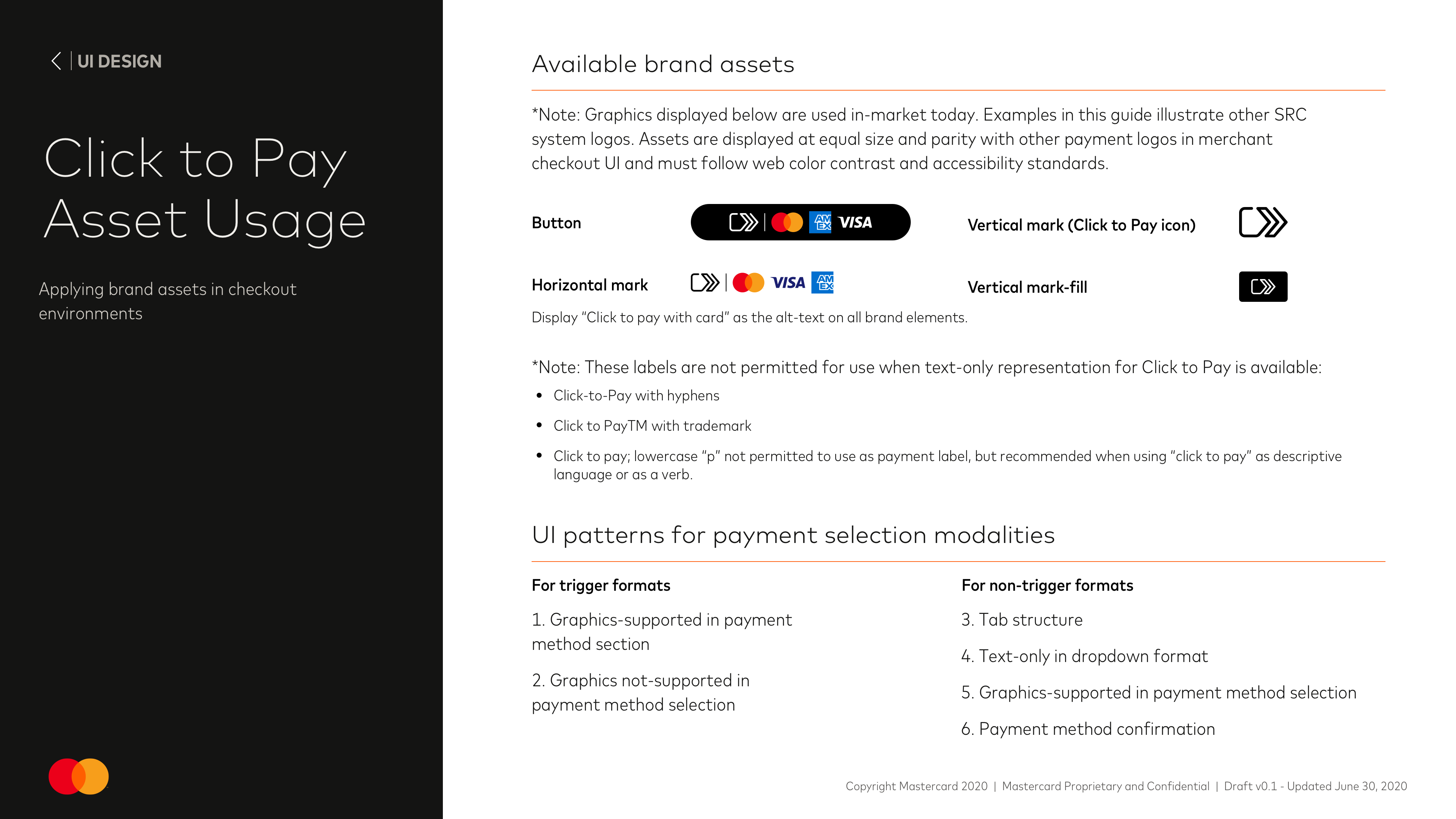
I joined at the time the Product and Experience Design Team (PXD) was creating the Implementation Guide for merchants to use Click to Pay, Mastercard's smart and secure online payment method. The guide included best practices, suggested user flows, UI screen exmaples, and other slides to help merchants create smooth click-to-pay experiences.
Click to Pay has 2 types of users—consumers and merchants. On the consumer side, it is Mastercard's best interests to ensure user friendly UX so that people will continue to use the service; on the merchant side, good UX will lead to the implementation of Click to Pay, which generates revenue. Implementation is the merchant's responsibility, so this guide was created to ensure a good experience for end consumers and consequently, all parties.
Click to Pay has 2 types of users—consumers and merchants. On the consumer side, it is Mastercard's best interests to ensure user friendly UX so that people will continue to use the service; on the merchant side, good UX will lead to the implementation of Click to Pay, which generates revenue. Implementation is the merchant's responsibility, so this guide was created to ensure a good experience for end consumers and consequently, all parties.
Deliverables—
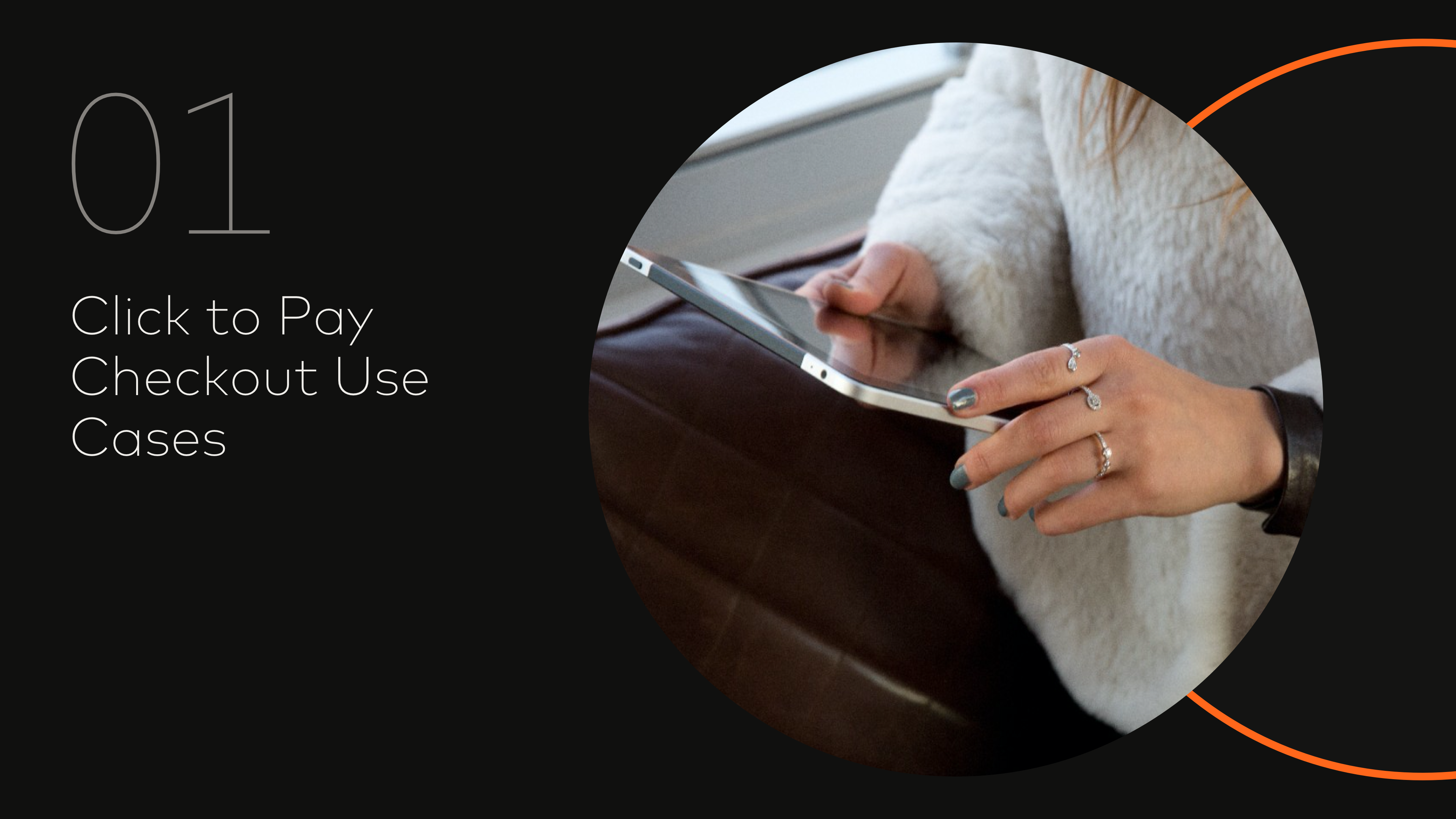
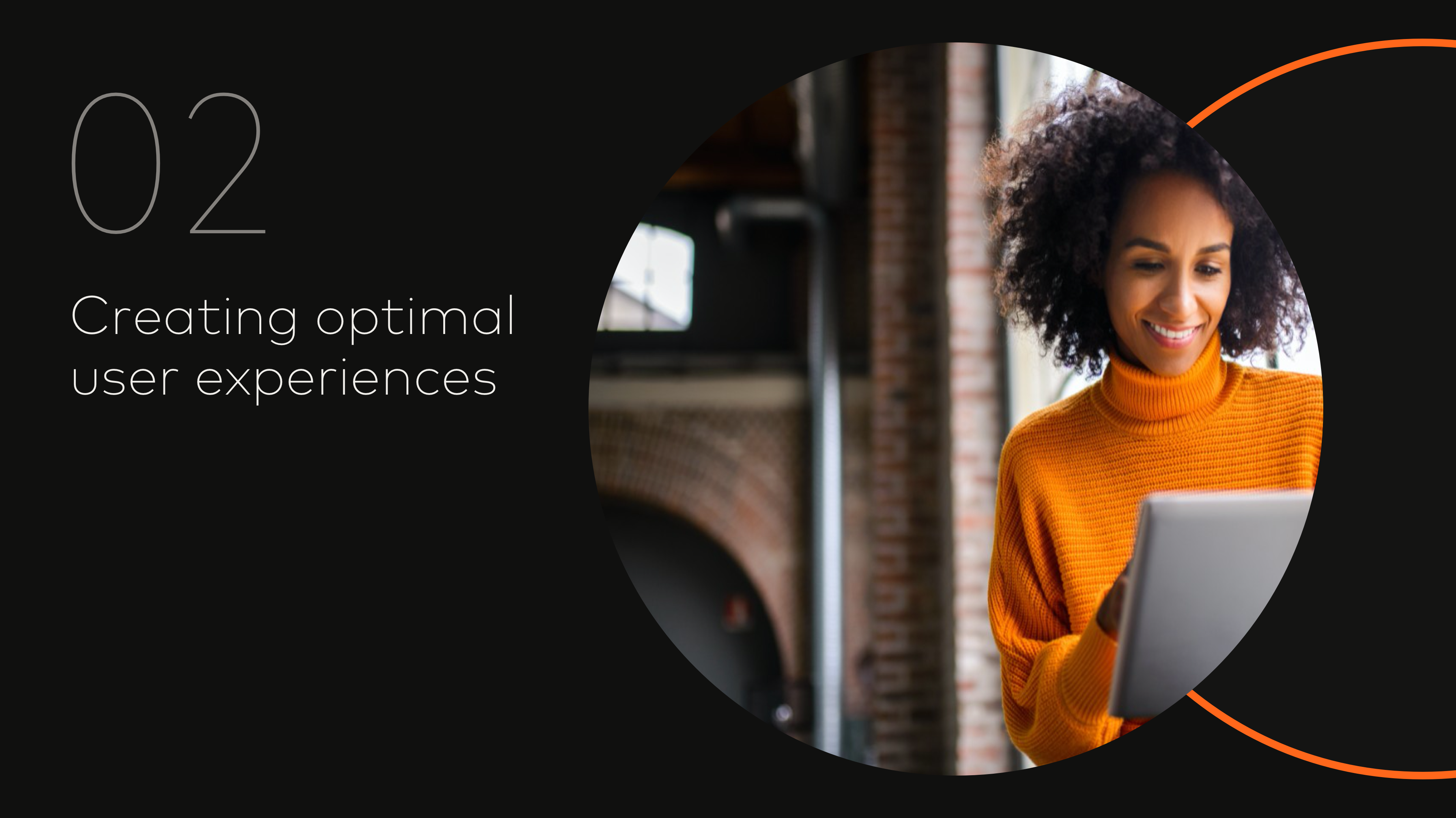
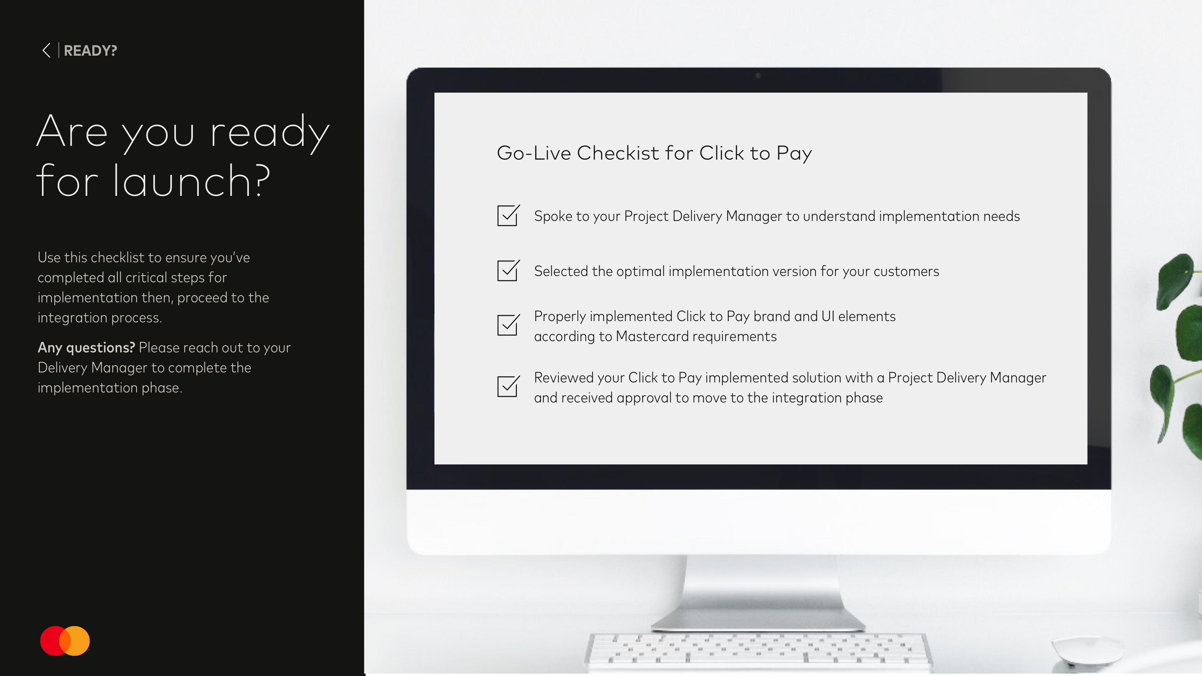
Examples of the Guide pages I worked on.
The link to the full guide is not public yet but here is a glimpse of the pages I worked on. More examples of the guide and of my contributions can be found here!
Lessons learned—
Keep iterating and getting feedback.
I worked closely with other designers and product managers on the content and visuals of the guide. We had bi-weekly syncs to provide + receive feedback. Something I learned was asking for feedback also allows for more conversation about what is being designed and also why it is being designed.
It was interesting to be a part of discussions that ranged from extremely detailed (word choice, colors) to big picture (purpose, what it means for users); ultimately, these discussions led to a better understanding of what design was like in the industry and outside of a classroom!
It was interesting to be a part of discussions that ranged from extremely detailed (word choice, colors) to big picture (purpose, what it means for users); ultimately, these discussions led to a better understanding of what design was like in the industry and outside of a classroom!
Project 2: Customer Proximity—
Everyone benefits from understanding customers.
I helped create materials for Mastercard's internal initiative of Customer Proximity, which encouraged all employees to get closer to their customers and consumers.
Deliverables—
Even emails are an experience.
One deliverable I helped create was an email template to make notifying employees of Customer Proximity opportunities easier.
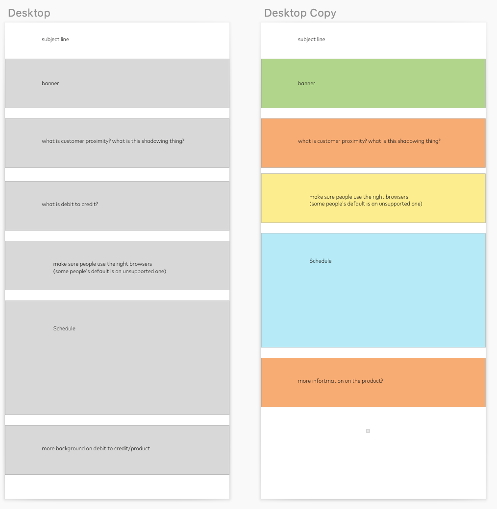
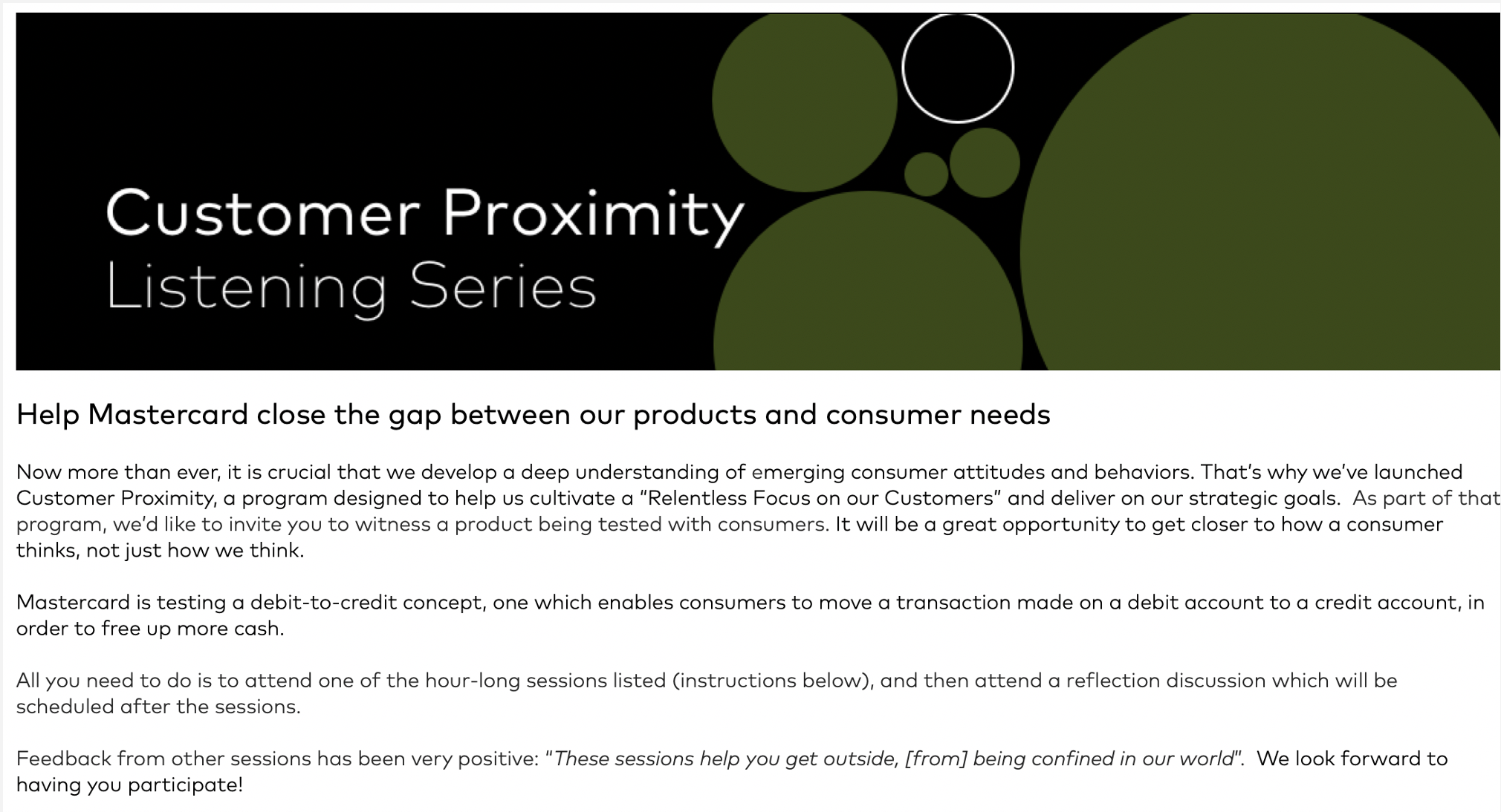
This was the top half of email sent using the template! I cropped out potentially sensitive information.
Lessons I learned—
UX can be applied to anything.
Given the short duration of my internship, I didn't work on a feature or product following the traditional design process. Instead, I was involved with multiple projects at the same time.
Still I applied my design process to every deliverable and embraced design as a mindset instead of a checklist of steps like school projects are. As noted, even reading an email is an experience that can be improved through user considerations.
Still I applied my design process to every deliverable and embraced design as a mindset instead of a checklist of steps like school projects are. As noted, even reading an email is an experience that can be improved through user considerations.
Project 3: Intern Challenge—
How might Mastercard help people during or after the pandemic?
During my time as an intern, I worked with 6 other interns to research and ideate how Mastercard products or services could be useful either during the global situation or afterwards during rebuilding efforts.
We met for half an hour every day for 2 weeks of the internship. The challenge presented us with problem spaces to choose from and we each researched all of them individually to narrow each space down. Then we voted on which we'd like to tackle and conducted further secondary research. Eventually, we noticed small businessed were being forced online avid the pandemdic.
We met for half an hour every day for 2 weeks of the internship. The challenge presented us with problem spaces to choose from and we each researched all of them individually to narrow each space down. Then we voted on which we'd like to tackle and conducted further secondary research. Eventually, we noticed small businessed were being forced online avid the pandemdic.
Deliverables—
Help small businesses move into ecommerce.
Our final idea was to help small businesses set up online shops that make it easy for their customers to support them. Specifically, this could be accomplished by partnering with website builders like Squarespace, Shopify, etc., to offer Click to Pay as a quick, secure, and trusted payment method. To see our process and the research results, view this PDF.
Lessons I learned—
Designers bring everyone together and most importantly, advocate for users.
I wanted to make sure my team’s idea was solving real problems for people so I suggested methods for research + facilitated discussions and ideation based on my experience with design thinking.
Overall, work was distributed among the whole team, but given everyone's hectic schedule, I took on more of a facillitator role by sending When2Meets and guiding our meetings. In addtion, I conducted surveys on UserZoom for primary research and to validate our final idea. Our idea was well received by the team that reviewed our submission.
Overall, work was distributed among the whole team, but given everyone's hectic schedule, I took on more of a facillitator role by sending When2Meets and guiding our meetings. In addtion, I conducted surveys on UserZoom for primary research and to validate our final idea. Our idea was well received by the team that reviewed our submission.
Reflections—
The experience of working with a whole team of designers, PMs, and content writers reinforced my belief in the power of different perspectives. Content writers helped point out where descriptions of UI elements could be reworded and PMs always brought up areas that could be improved.
Through numerious feedback sessions and iterations, I've learned that design is never done and by definition, is ambigious. I think an advantage of working on a number of different projects instead of just one was being able to be curious and question more than one problem space.
Initially, I had the misconception that all of my work had to be from scratch. After listening in on meetings and familiarizing myself with what the team has been doing, though, I learned how to effectively and efficiently build off of exisiting design systems, content, etc., and leveraging others' designs. This would save time, result in overall consistency (for brand and treatments), and allow me to use more mental energy on thinking about my users.