Bank of America’s mobile banking app has many hidden features/services that customers could find useful, but have difficulty actually finding due to its design. Not only does this result in a less than optimal UX, it's a missed business opportunity:
- Users don't notice the app's other features/BOA's other products and are unlikely to use them
- Not easy to find where to schedule an appointment or get customer support, which is important considering BOA's dedication to good customer experiences in real life.
My goal for this redesign is to better ensure the app does that. Success metrics could be an increase in users, an increase in average review ratings, or more customers contacting BOA service lines through the app.
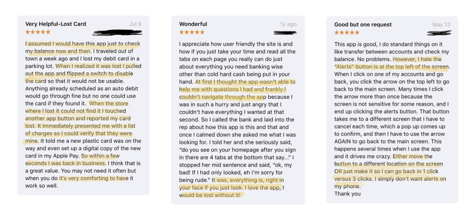
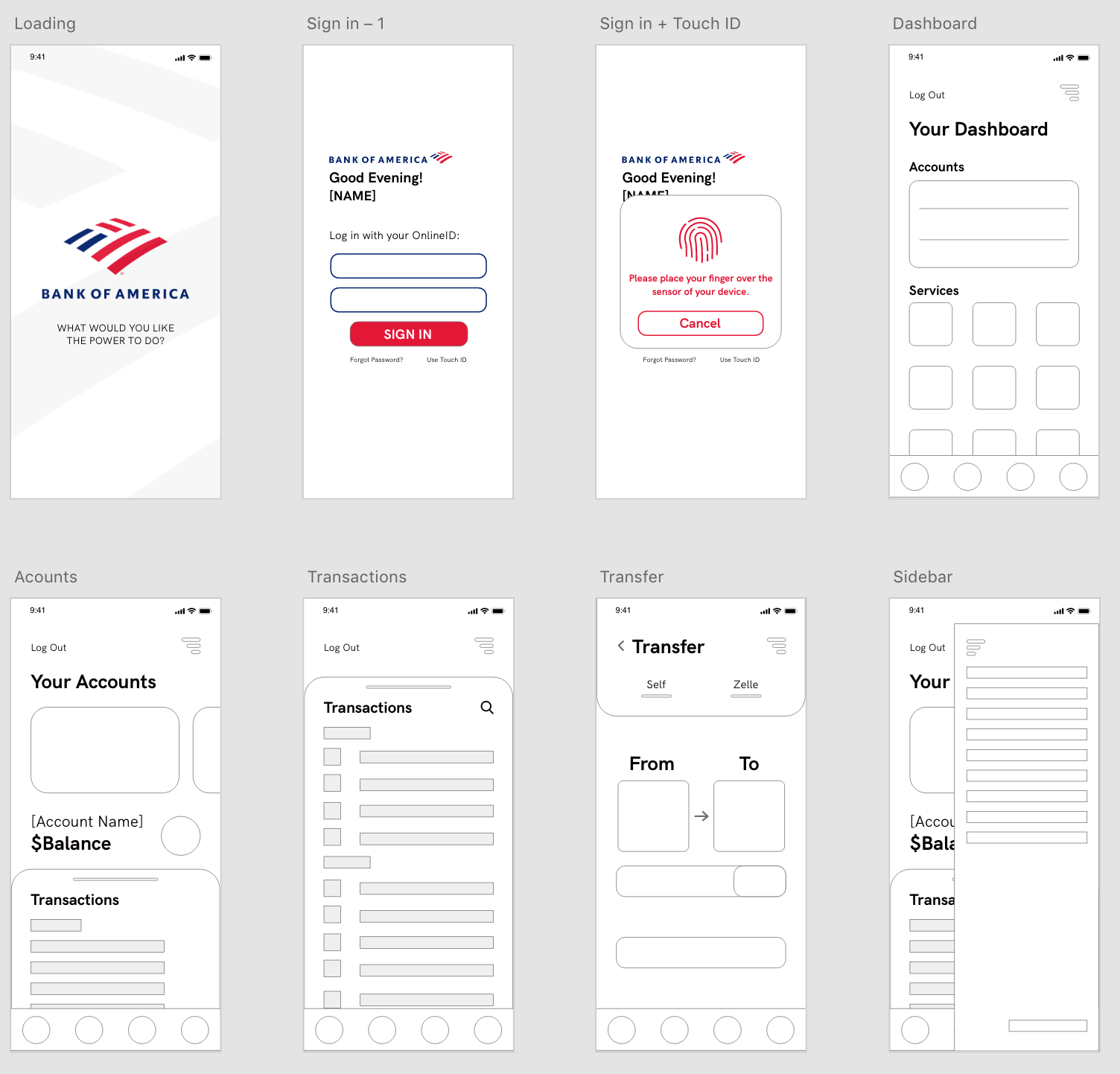
- Unoptimized Organization - Many users felt that the app had great features and raved about how they could do pretty much everything on the app, if they looked hard enough for it. Some commented that the UI makes each feature look like a distraction.
- Aesthetics and Feel - Users noted that the app’s UI felt basic and directionless but exceptional customer service over the phone did make up for it. A major part of this redesign was to make sure each design decision was intentional. Customers should not need to call support in order to use the app.
- Peace of Mind - The app’s easy access to support quickly calmed customers who lost their card or had their account breached. Money is extremely important to most people who will freak out if something goes wrong. In addition, the app provides easy of access when checking on accounts in times of suspicion, which in turn provides peace of mind.
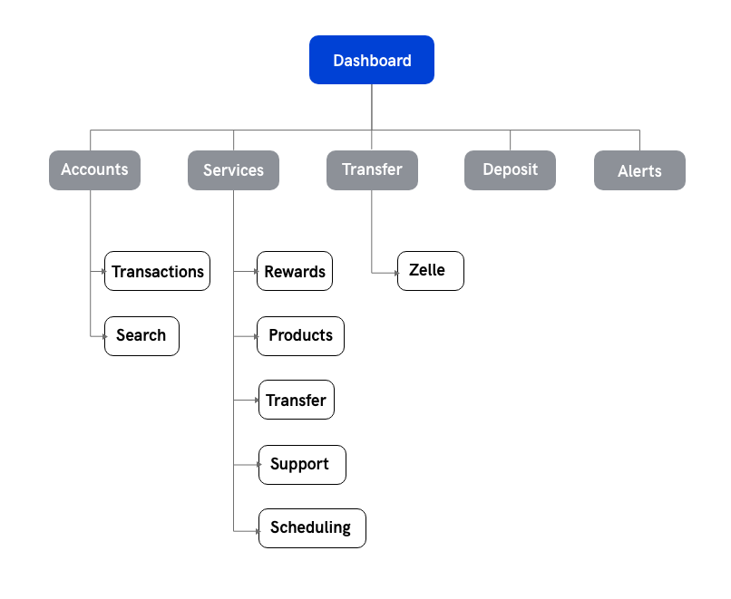
- Streamline - Increase ease of access and clarity of currently hidden features.
- Centralize - Concentrate pertinent interactions and information into a singular dashboard.
- Update - Bring app aesthetics up to speed with current visual trends and patterns.
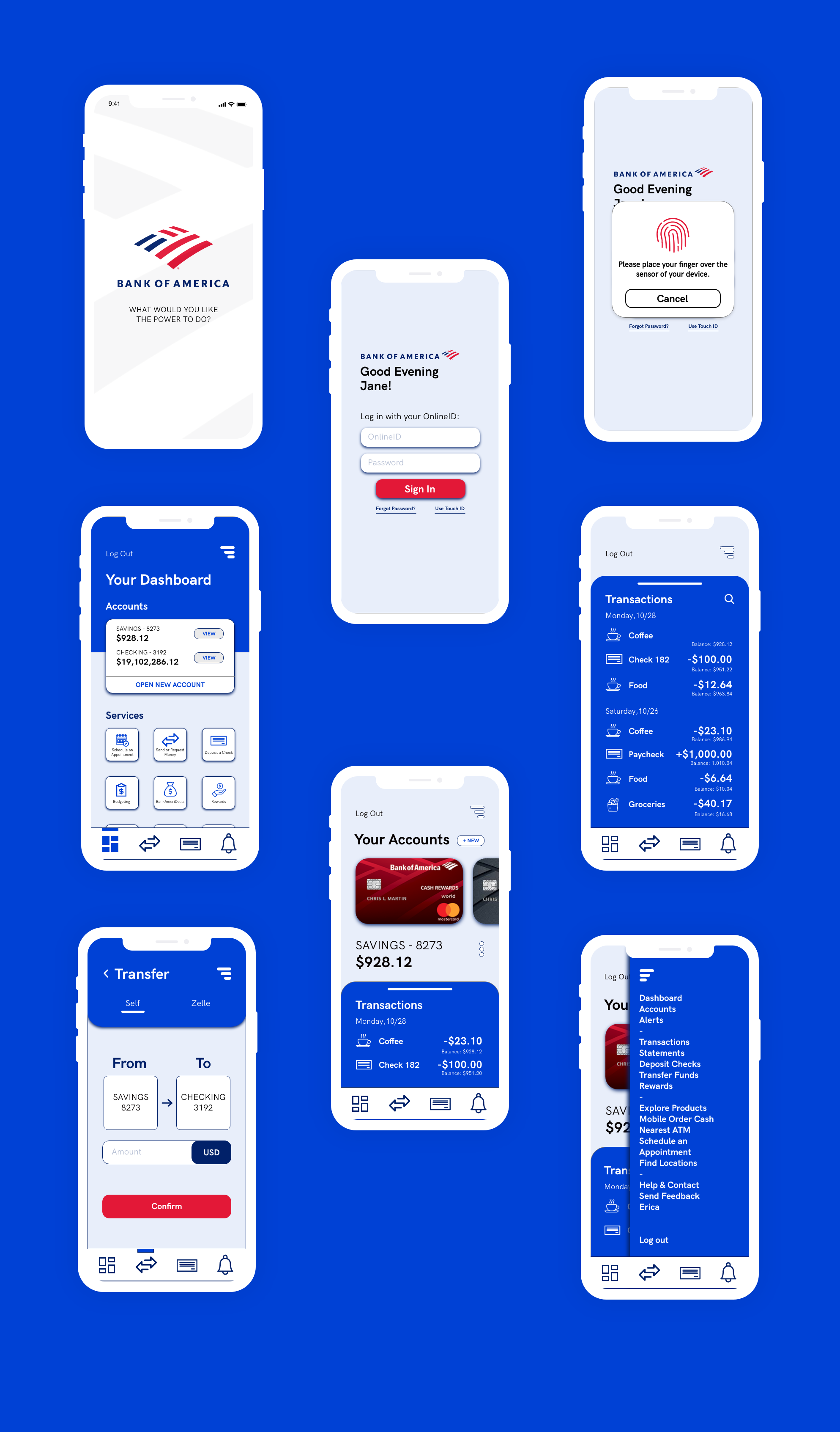
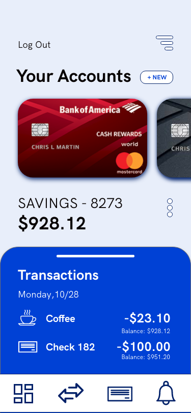
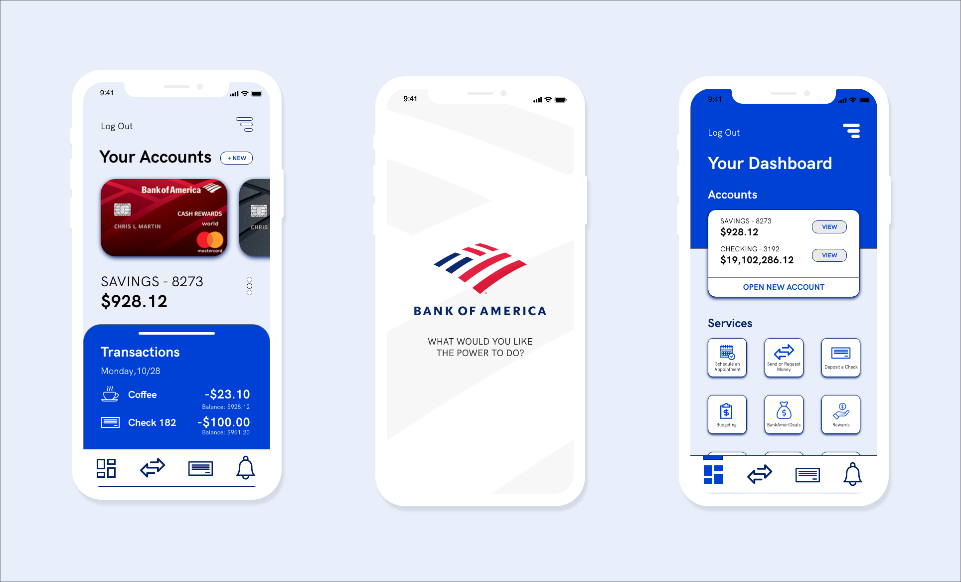
Accounts - For those with multiple accounts, it could get confusing going just by account numbers, so I wanted to create additional visuals for easy recognition. A representation of an account in real life is the credit/debit card tied to it. Customers are more likely to recognize which account is which by seeing the card they use in real life.
Transactions - A transaction history is useful information when one cannot remember how much an item was for example, or to potentially catch fraudulent charges. However, transactions can get buried, adding an ability to search for specific transactions remedies that.
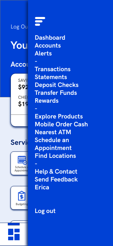
Dashboard - The original dashboard was hidden away. Smaller icons and more icons per row will provide a broader overview of the app. In addition, the hamburger menu opens up to a list view of the dashboard so that each feature is represented and can be a place to see an overview easily (This was actually implemented in a later update!).
The app’s easy access to support quickly calmed customers who lost their card or had their account breached, so I wanted to make said support as easy as possible to find.